Contact Timeline
product
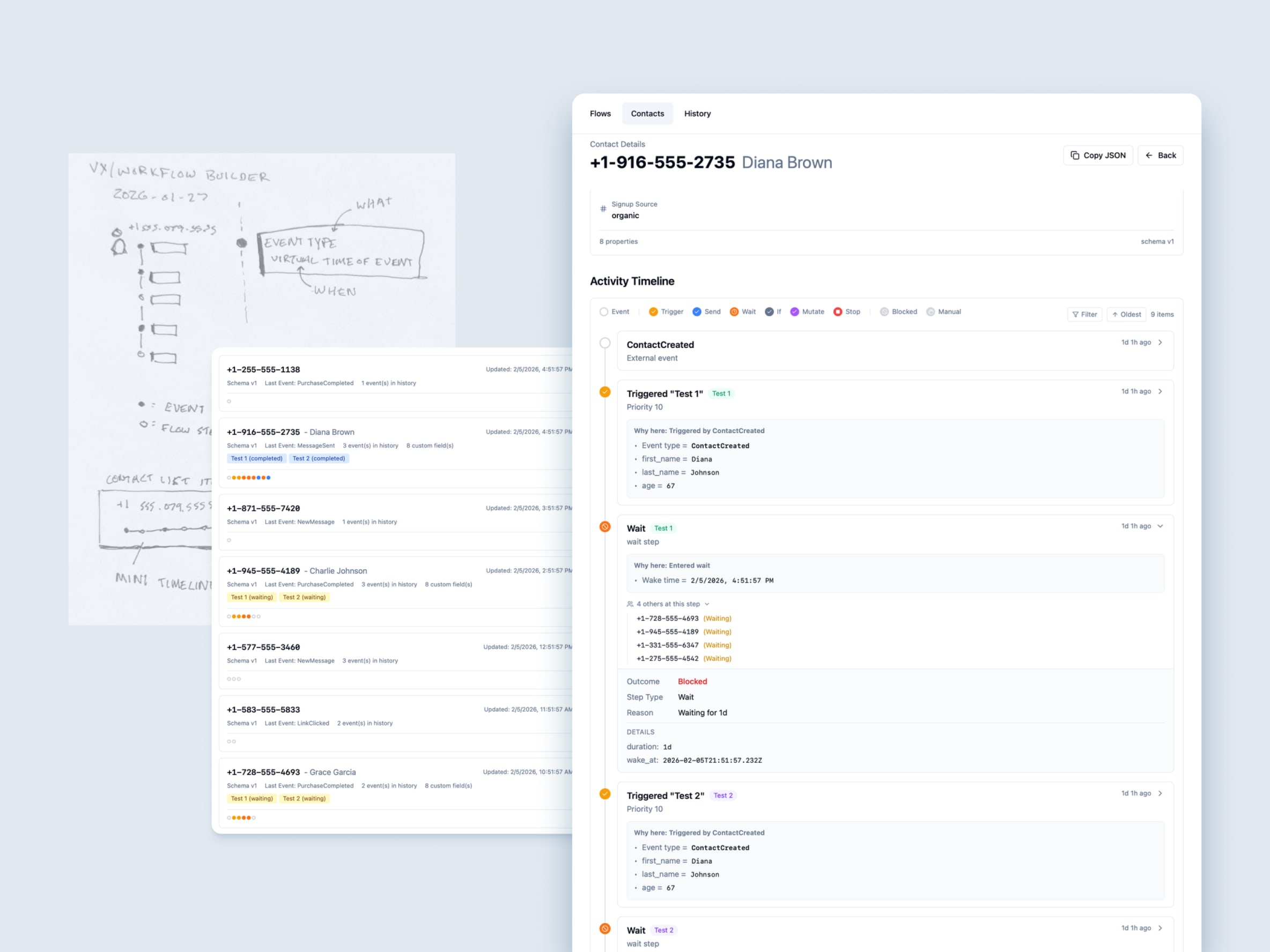
Replaced the complex swimlane view with a single, easy-to-read timeline that tells the story of a contact’s journey through your flows.
What’s new:
- Unified Timeline - One chronological view of everything that happened to a contact
- Visual Consistency - Timeline markers use the same colors as the flow editor, so it’s easy to connect the dots
- “Why Here” Context - Each step shows the data or conditions that caused the contact to reach that point
- Mini Timeline Preview - Contact list cards now show a compact timeline that matches the full view
Active Flows Cards:
- At-a-glance view of all active flows for a contact
- Status icons show what’s happening (running, waiting, paused)
- Cleaner layout with labeled rows for Status and Step
This makes it much easier to understand what happened to a contact and why, without needing to dig through technical details.