demo 260413
-
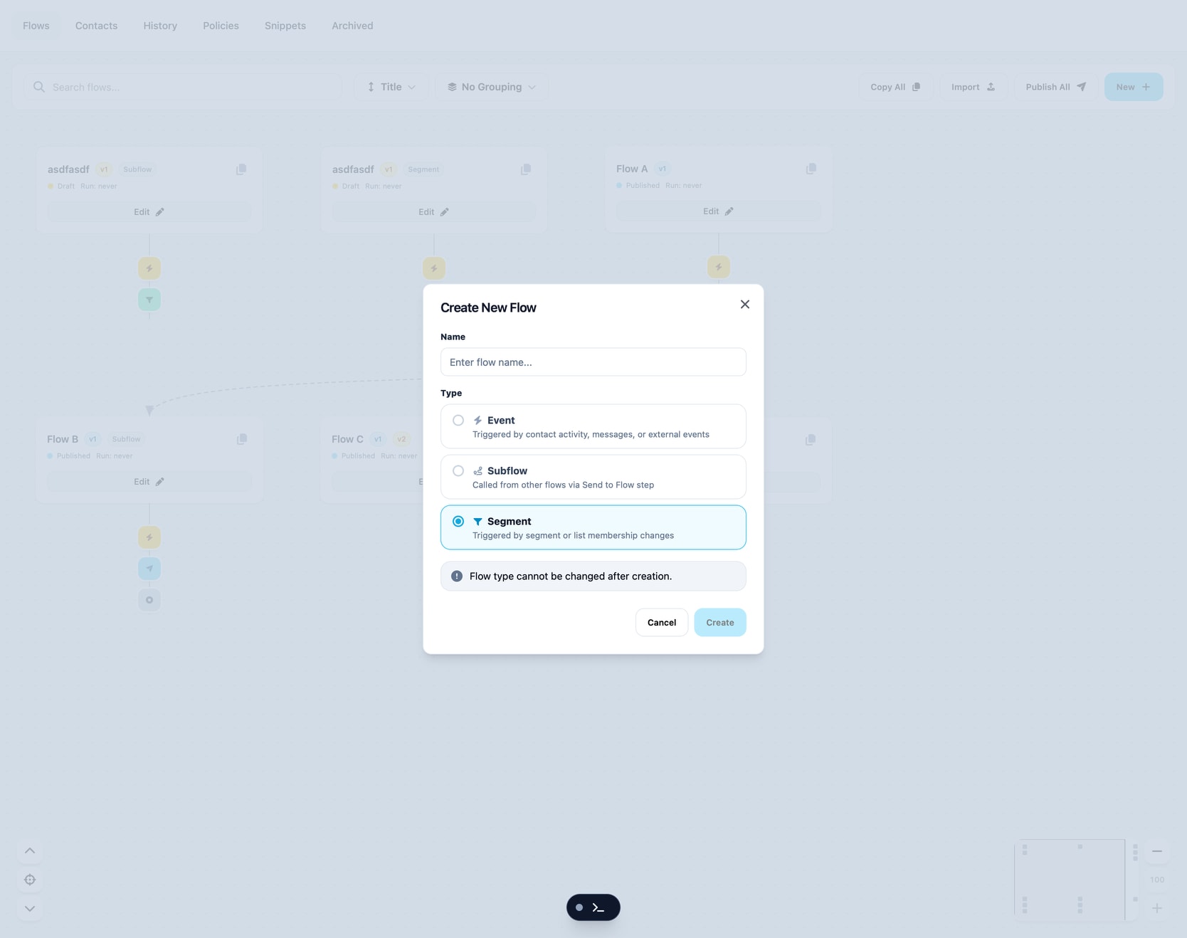
Flow Types
This was a concept that tried to move the decision of what the flow would be to the creation step. This in theory could simplify details drawers further down, and allow for easier development process.
However this is moving complexity to the user and making it difficult to explore and change a flow as you are building. Again leading to a rigid and unforgiving user experience.
Since we can derive this type from the details of how the user configures the flow this was eventually dropped. Asking the user to categorize a flow before they have made it is unnecessary and tedious.
New Node Search
Added search to the new node modal with auto focus so you can quickly filter to the node you need.
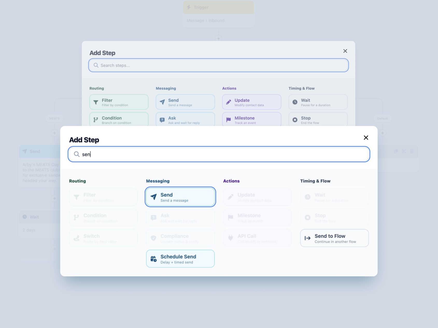
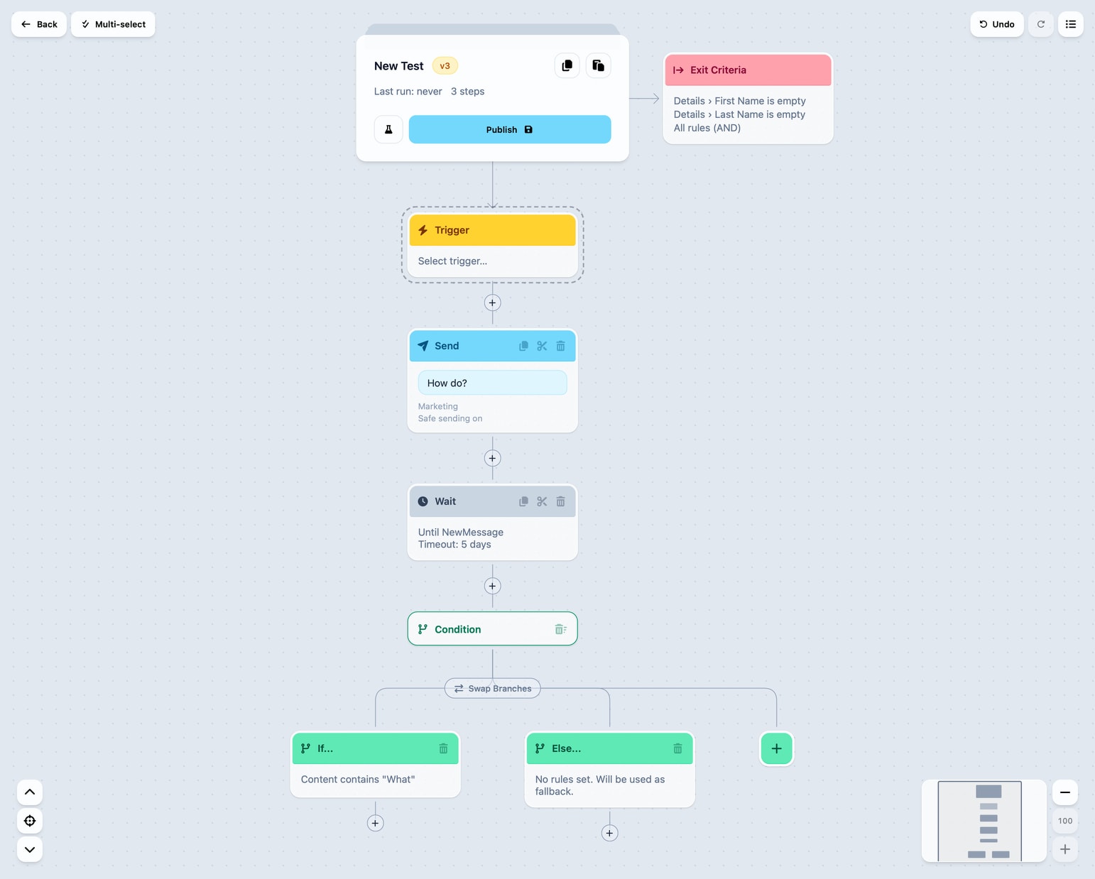
Combined Routing
The routing nodes were causing confusion so we combined them into one. You can now start with a simple if statement which works as a filter. More complexity can be built up as you add more else nodes.

Back to Basics
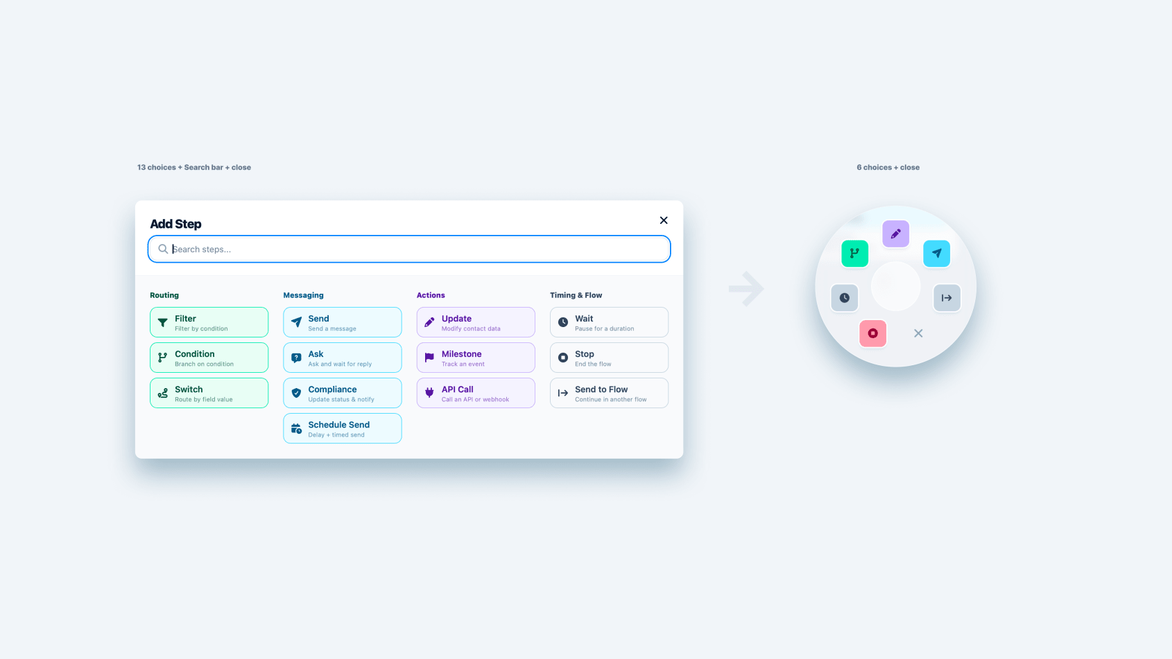
Over the past month or so lot of scope creep and details had made their way into the prototype. Some things, like the simulator, were becoming distracting and fragile. Other items were opening more edge cases that distracted from the core user experience of the canvas. Some examples here are we were approaching ~13 node types.
This meant everything you needed to add a node you had a choice to make between 13 items. Some of these nodes were intended to save time by composing several nodes together. However this was costing you time in the end because you need to decide and find the node you want and then hope that it was configurable in just the right way, a thing that was frequently leading to abandoning the more complex nodes after you found a dead end only to return to having to use the more simple nodes in the end.
All of this led to an experience that felt disjointed and messy.
A short list of things gutted (important to note that no required functionality was lost):
- ask node
- compliance node
- switch node
- filter node
- api node
- milestone node
- simulator
- flow type
- schedule send node
- policies
- cooldown
- pause/resume
Note that Segment style rule based flows are still a thing, they are moved inside the trigger configuration, this leaves the choice of “flow type” to the point where the user is ready to make that decision.
Give it a play: https://proto-workflow-builder-mk1.vercel.app/flows
Ask Node Exploration
Keeping with our recent objective of reducing the number of core nodes, and keeping them as flexible as possible; we decided to explore options without having an explicit Ask node.
Our reasoning here was that every part of the Ask nodes we had made up until now were combinations of Send, Wait, Update, and Condition nodes. Essentially we already had all the nodes we needed to capture a response from a question.
This was also compounded with lots of feedback that the Ask node was not flexible enough.
So we made a few small extensions:
- We added a
Wait untiloption in theWaitnode. This allows you to wait for a new inbound message - We added ability in the
Conditionnode to check details of theLast inbound message
We only these changes you can now ask a question and wait for an answer, and configure a response in nearly infinite ways based on the response or no response. This gives us more power all with saving a node type.
The other benefit is now all of the details of the asking are explicit and on the canvas.
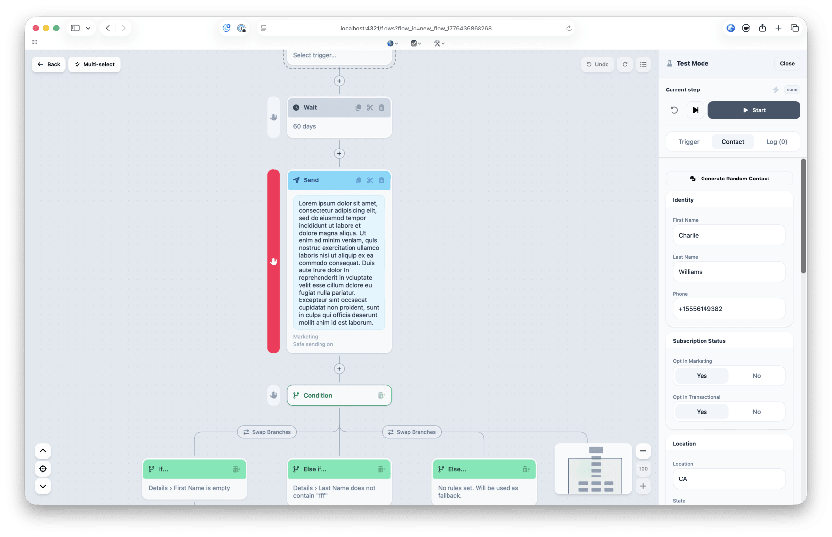
Breakpoints in Test Mode
One lingering issue with he Test Mode was that it wasn’t practical to test mid-flow contact meta data changes. Specifically simulating side-effects happening outside the flow.
The exit criteria feature made this even more of a pain point.
So we’ve added the ability to set a breakpoint that allows you to choose a node to hold the test at. This then allows you to edit contact details before continuing the test.
Other enhancements are that we use common components from this prototype so it the Test Mode feels more consistent.
Give it a play: https://proto-workflow-builder-mk1.vercel.app/flows
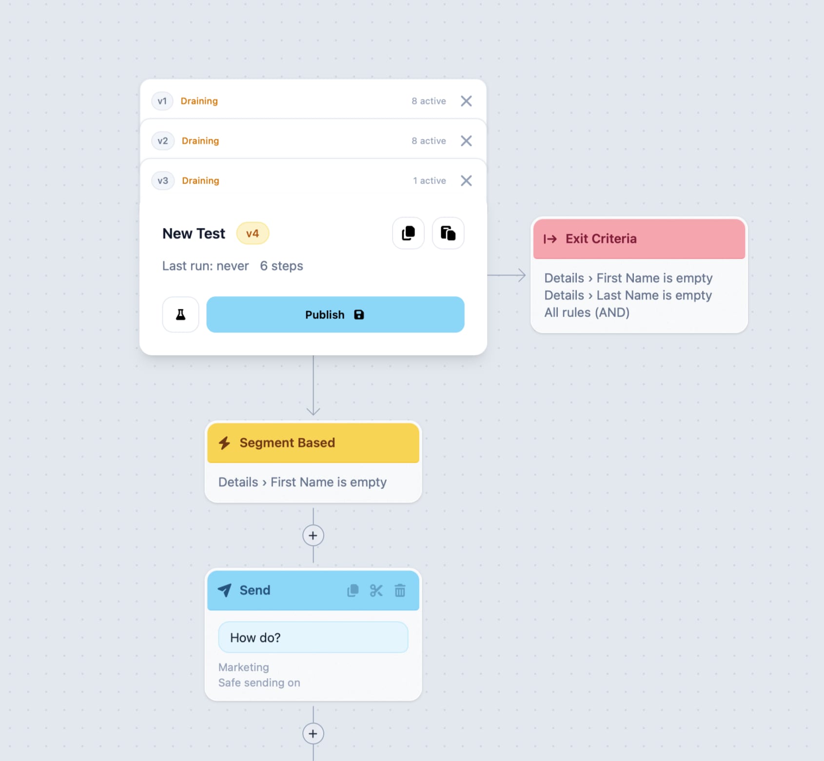
Exit Criteria
This is a frequent piece of feedback we were getting, the ability to set rules that will exit a contact from the flow. This, in theory, should prevent the need for lots of overly-defensive condition nodes within a flow.
Give it a play: https://proto-workflow-builder-mk1.vercel.app/flows
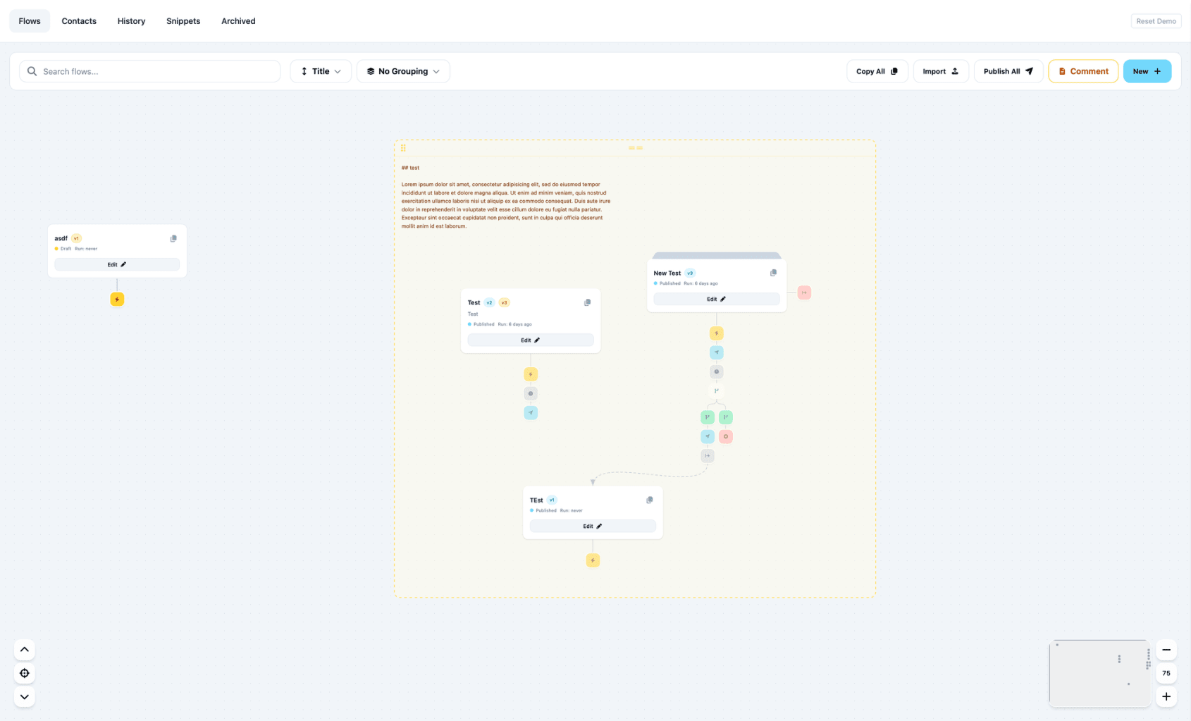
Manual Canvas
Something that we held off on because of the explosion of edge cases that may need handling. This combined with comments gives the user extreme flexibility in communicating their intent with the canvas and flows.
From the main canvas, not the edit canvas, flows can be arranged manually be dragging the around. These locations are expected to store and sync to all users.
You can still use the sorting and grouping modes on the canvas but comments will not show in those views.
Give it a play: https://proto-workflow-builder-mk1.vercel.app/flows
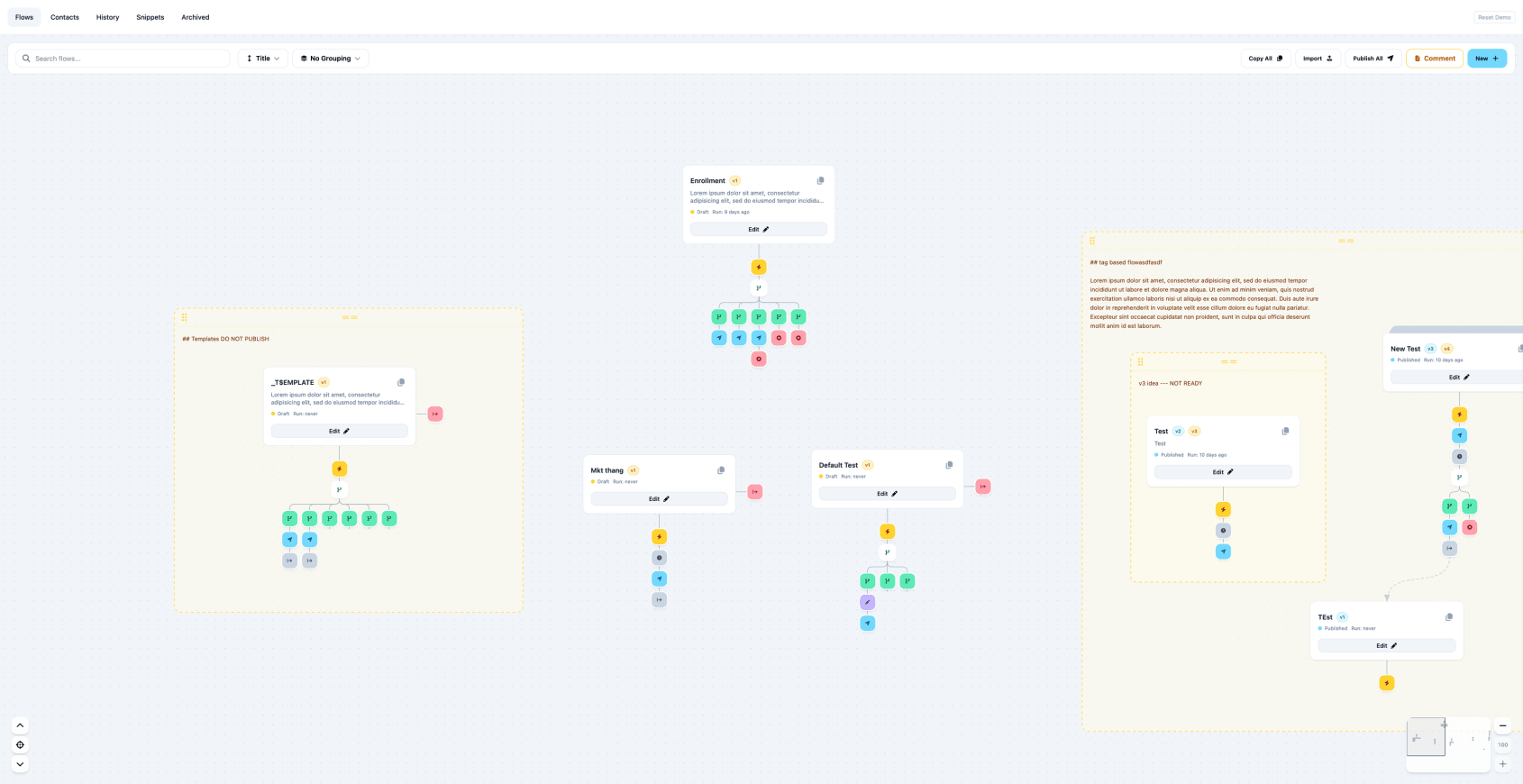
Comments
There was still a remaining issue with the canvas. It perfectly captured what the code/system would be doing behind the scenes which is a solid improvement from Voxie configuration today.
However the fuzzy concepts like “these 3 flows are related” even though there is nothing logically connecting them. This seems to be a key reason that 3rd party tools are being used to communicate flows. The manual, spacial placement of flows on the canvas helps, but extending the canvas to allow comments gives us another tool to help communicate intend from the users.
Comments allow drawing a rectangle on the canvas, typing text to label or communicate things explicitly.
The extra benefit is that we can you the comments as containers to help you drag sets of flows around the canvas.
There is a side effect that these concepts are recursive and can be nested.