demo 260511
-
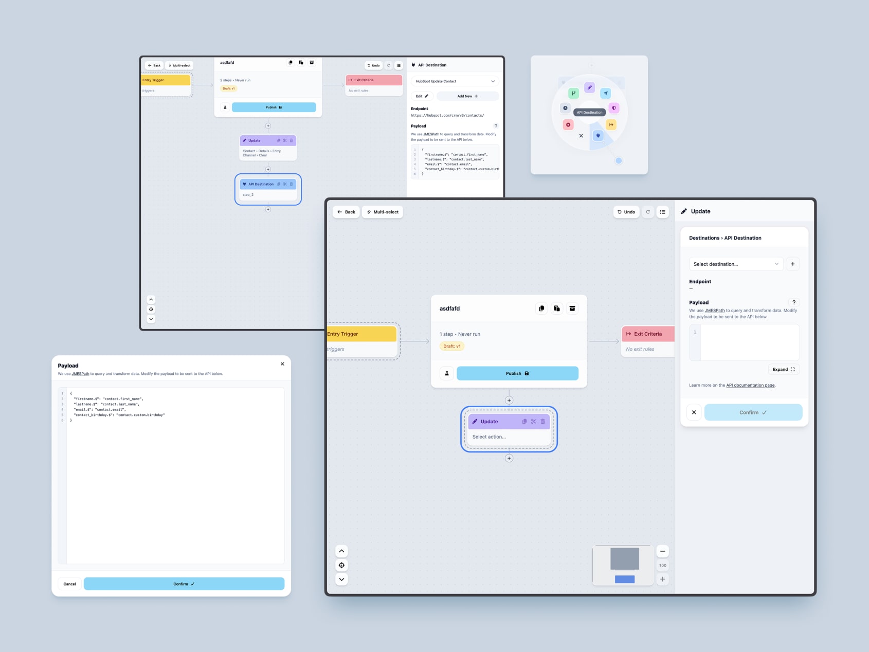
API Destination
First Pass
Made API Destination its own step type:
- blue palette and a globe icon in radial menu
- editor:
- endpoint section with URL variable inputs
- full-screen payload editor modal: Expand button to enter it, Cancel/Confirm footer to leave it, with a white code block and a slate-100 gutter
- A Sample Event Data help modal so you can see exactly what shape the payload arrives in
- Edit / Add destination icon buttons
Architectural Pivot
After living with it, we moved API Destination from being its own step type into the Update action.
Polish
Closed it out with typography and spacing work — inline URL variable labels, tighter line-heights, shortened docs link copy, and moving the docs link down to the bottom where it belongs.
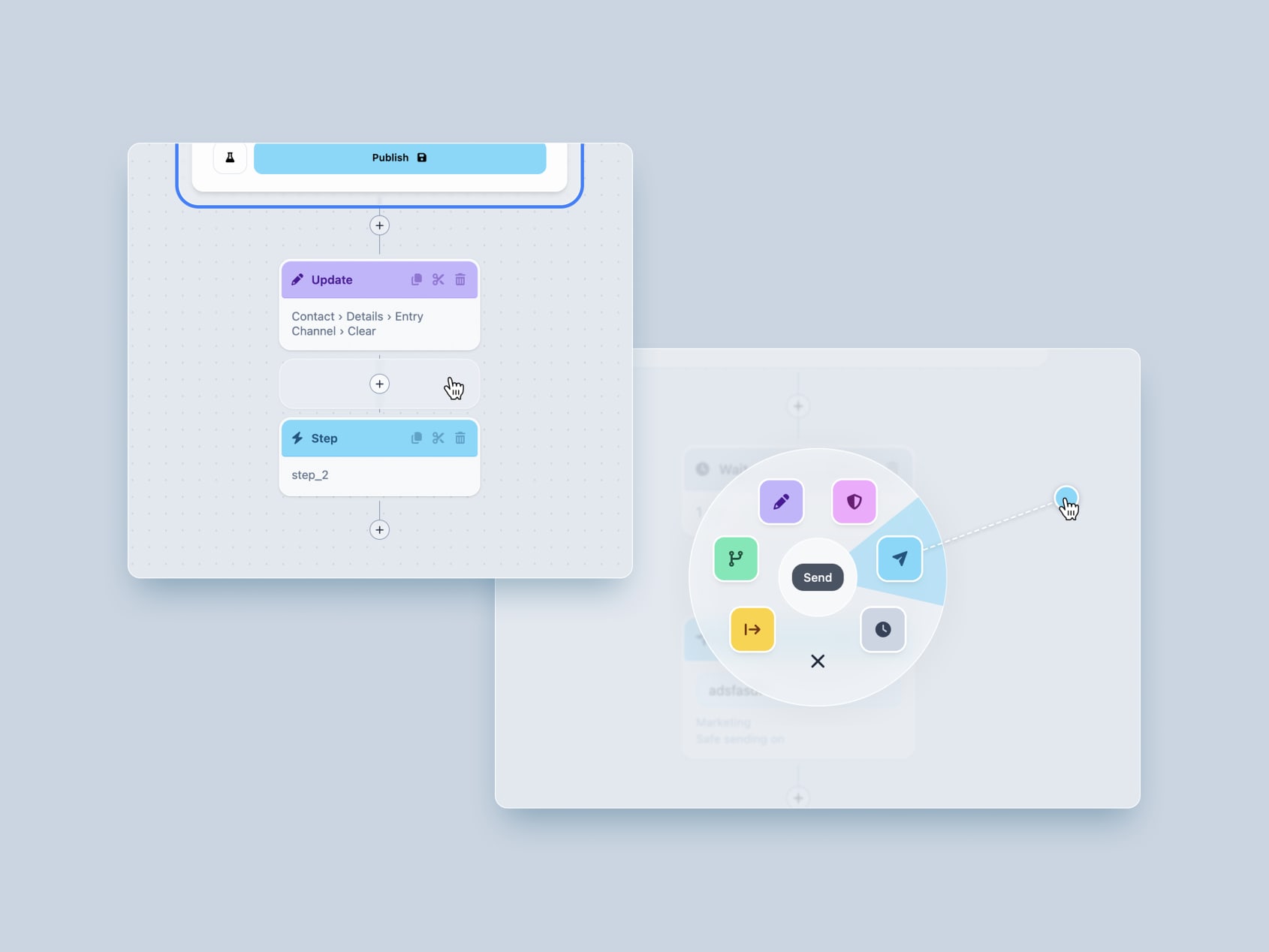
Canvas Interactions
A few days of close, fiddly work on the two interactions you touch most on the canvas — the radial step menu and the add-node button. The kind of polish that’s invisible when it’s right and maddening when it’s not.
Radial step menu
- Drew the inner circle on top of the pie slice so the center reads cleanly
- Gated slice activation on exiting the inner circle, so you don’t accidentally trigger a slice the instant the menu opens
- Experimented with a center-hover-to-close gesture, then reverted it — it fought the muscle memory more than it helped
Add-node button
- Extended the hit area into the connector gap so the button is easier to land on
- Brightened the plus button on hover for clearer feedback
- Gave the hit area clearance from a node’s marching ants so the two don’t fight for the same pixels
- Dropped the expanding “Add step” pill — it was more motion than the moment needed
Performance
Skipped off-screen marching-ants work via content-visibility, so animation cost scales with what’s actually on screen rather than the size of the whole flow.
Flow Sidebar & Browse Drawer
- added voxie design style to overview sidebar
- added enter, exit, error stats to sidebar
- added prominent button to get to sankey charts
- removed stats from canvas card

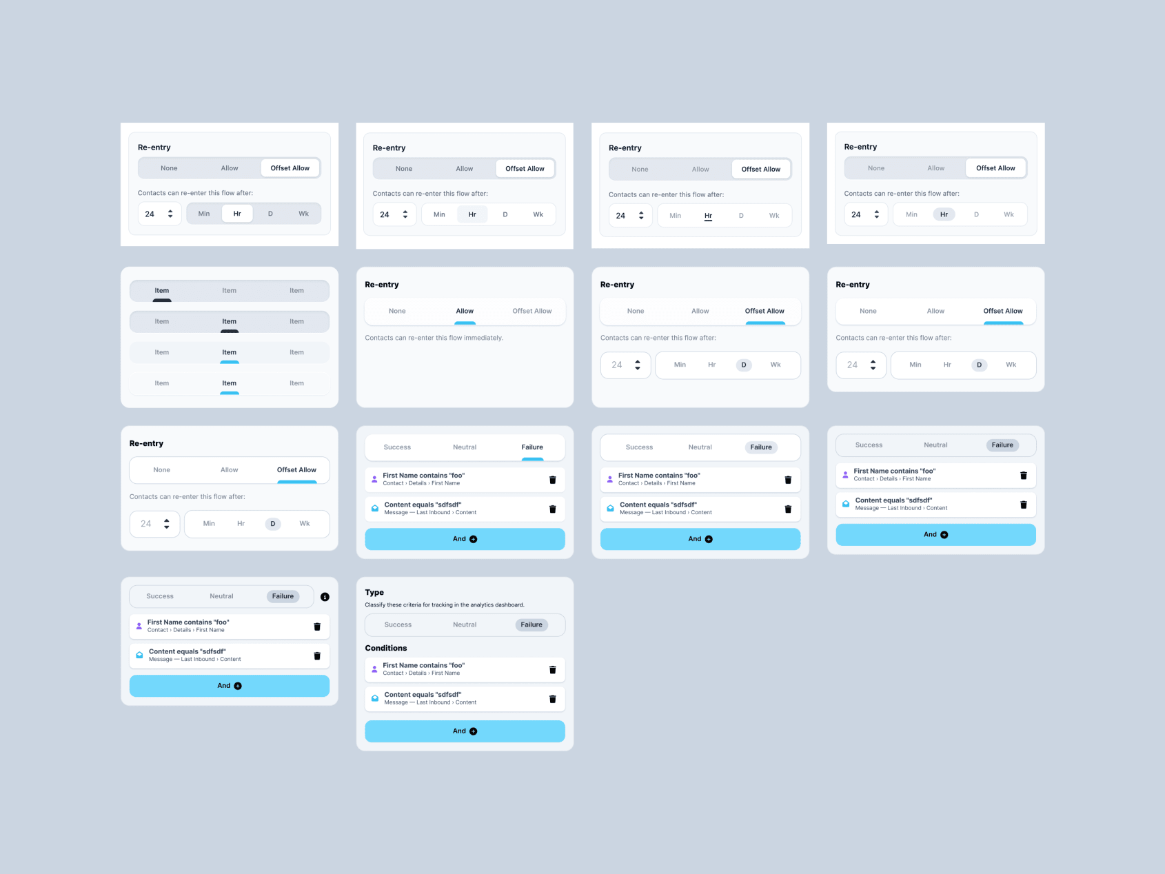
Re-entry
Main
Reworked the flow re-enrollment controls to have clear separation between not allowed, allowed, and allowed with delay.
Polish
- Matched the number input height to the unit picker
- Fixed the unit selector reverting when choosing minutes or weeks
- Tightened helper text to avoid an orphan word at the end of the line

Tab Input
Explored a new tabbed interface variant for input selectors to differentiate it from the current tabbed menu component. Gives segmented controls a tighter pill-highlight style when they sit inside form layouts.
Implemented the new style across the workflow editor:
- Re-entry controls
- Exit criteria
- Wait-unit picker
- Compliance opt-in/out
Copy/Paste Anywhere
Allows nodes to be copied and pasted across flows and into other apps. Output JSON can be edited and pasted back in.
Makes sharing commonly used flow snippets across team memebers possible. Or having AI create and edit flows outside the web app.

Performance Improvements
A focused push to make the flow canvas feel instant, even with hundreds of flows and thousands of nodes on screen at once. The goal: panning, zooming, and browsing should stay buttery smooth on a mid-range laptop — not just a top-end machine.
What got better
Panning feels immediate
- Grabbing and dragging the canvas now responds instantly, with no stutter or lurch on the first movement.
- Removed a hitch that happened the moment you started a drag, so the canvas tracks your cursor from the very first pixel.
- Inertia (the gentle glide after you let go) now only kicks in when you’re actually flicking the canvas. If your cursor was resting still before you released, the canvas stops cleanly instead of drifting unexpectedly.
The canvas stays smooth with lots of content
- The canvas can now handle 1,000+ nodes on screen — a dozen large flows at once — without slowing to a slideshow.
- Only the flows currently in view are drawn; flows scrolled off-screen no longer cost anything. As you pan, new flows appear right at the edge of the viewport with a quick, subtle fade-in.
- Removed heavy visual effects (background blur and per-node texture/noise) that looked nice but quietly tanked performance whenever the canvas moved.
The minimap keeps up in real time
- The minimap’s “you are here” viewport box now updates live as you pan, instead of lagging behind or jumping only after you stop.
Browsing flows is snappier
- Opening the browse view no longer auto-zooms way out to fit everything — which used to make the canvas look broken and tiny before you’d even touched it. You now start at a sensible zoom.
- Flow cards and their mini tree previews are far cheaper to render, so scrolling through many flows stays fluid.
- Hover effects on selectors were tuned to render more efficiently without changing how they look.

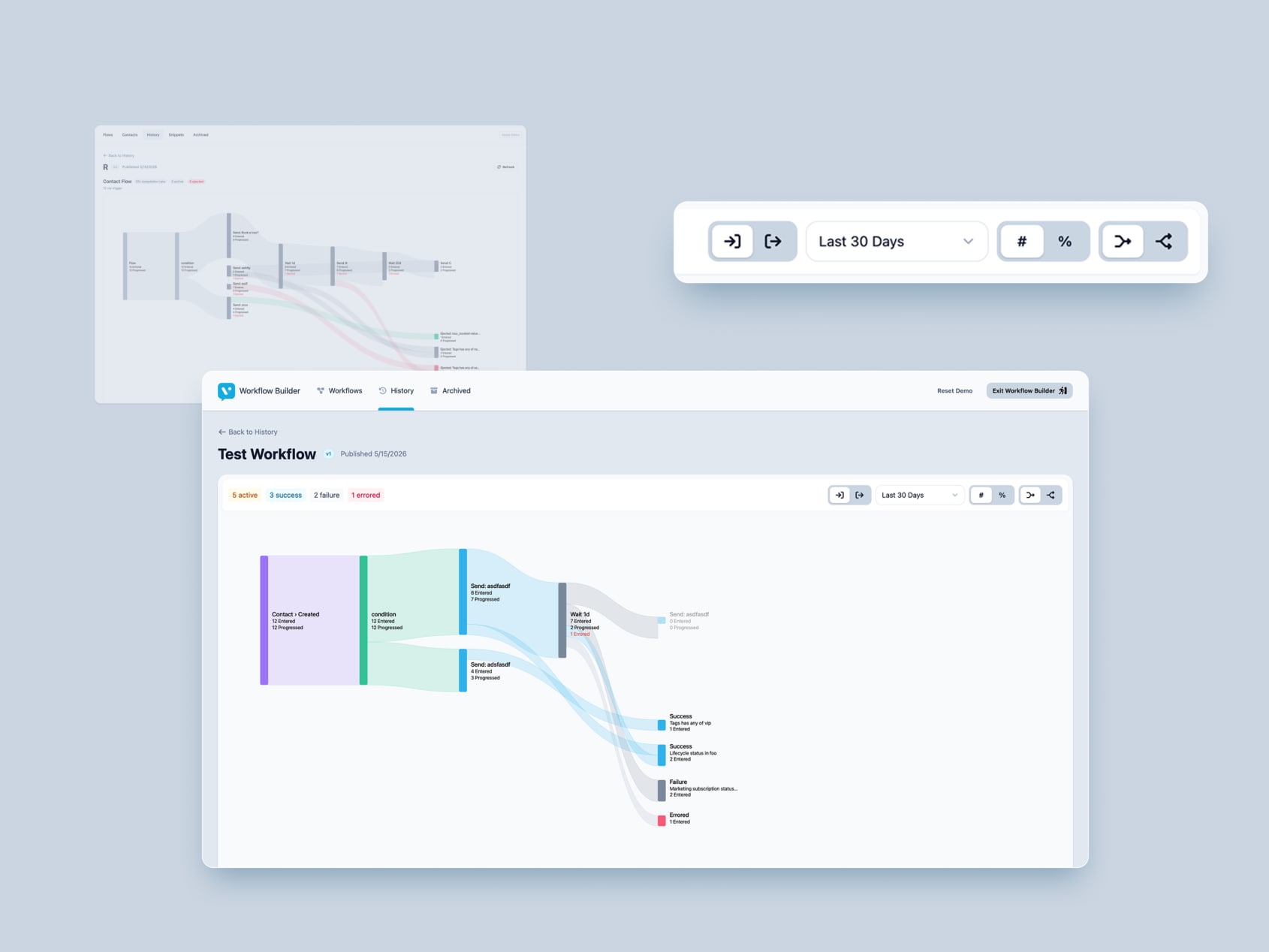
Sankey Updates
Lot of updates to bring Sankey chart closer to the finish line:
- colors match nodes closer
- success/failure/neutral exit criteria colors mirror Voxie analytics (sky -> success)
- date relative direction (enter v exit)
- combine or split exit nodes
- card and background layouts to match Voxie UI