Automation Trigger Refactor
product
Automation Trigger events have grown over time and skipped the nit-picking eyes of the UI team.
Our gaze can be avoided no longer, 🤣.
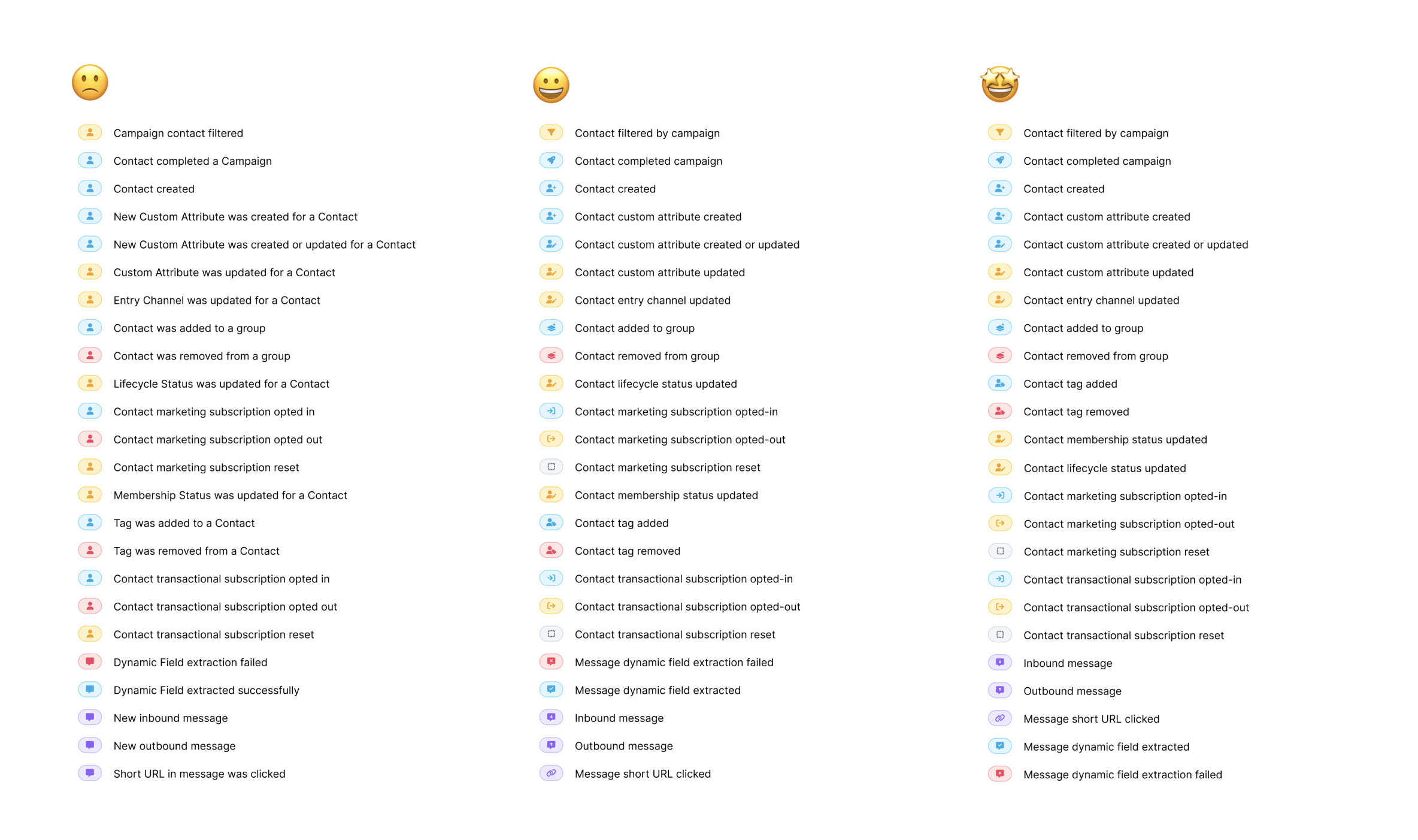
We updated icons, colors to be consistent with the concepts they are related to across Voxie.
This help break up the issue of all icons being the same, which makes scanning hard. Another issue was that color alone was being used to differentiate choices, which is a color-blindness accessibility issue.
Lastly we took a swing at refining the wording to match case/tense across all options and reordering the items.