Demo 260720
-
Workflow Builder Settings
Entry settings have moved form the Workflow’s root node in the editor to the Entry node.
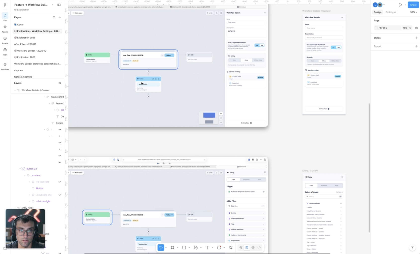
LCA in Workflow Builder
Highlighting key areas that need decisions at the product level.
Entry, Exit, Condition, Update notes all are able to filter on custom and traceable attributes. Which means we need to determine where the context for these attributes is set going forward.
Rough mocks for discussion at future meetings.
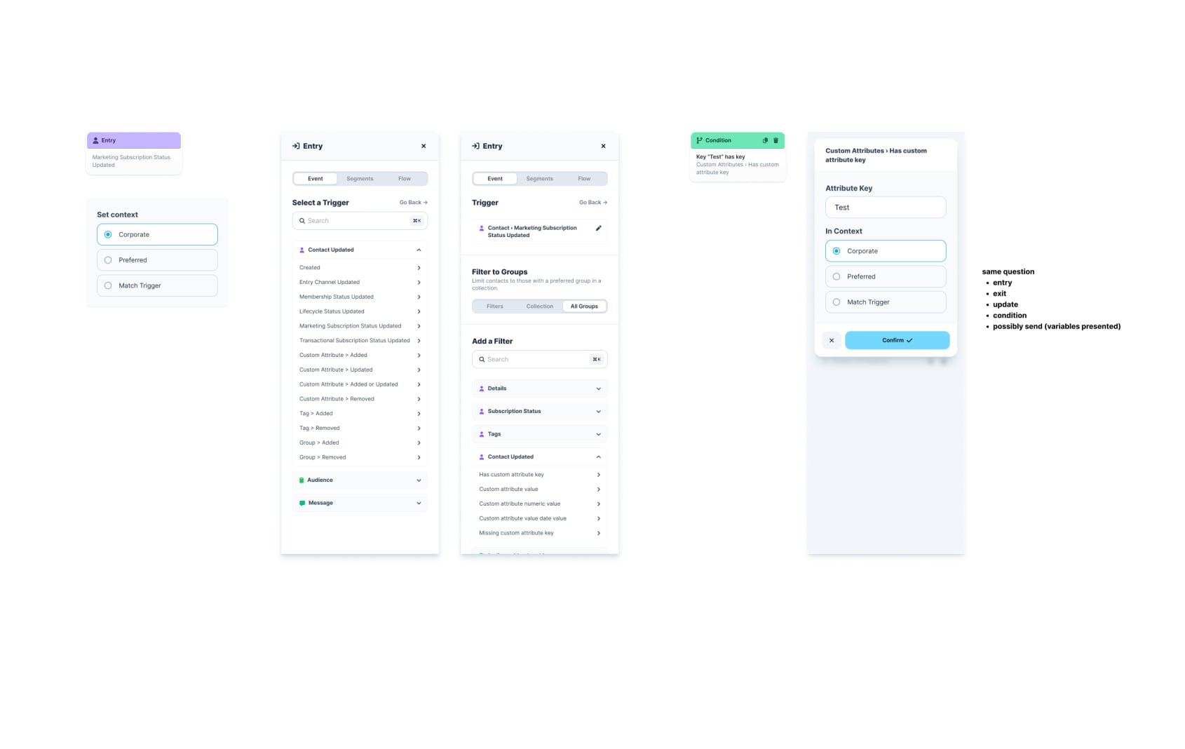
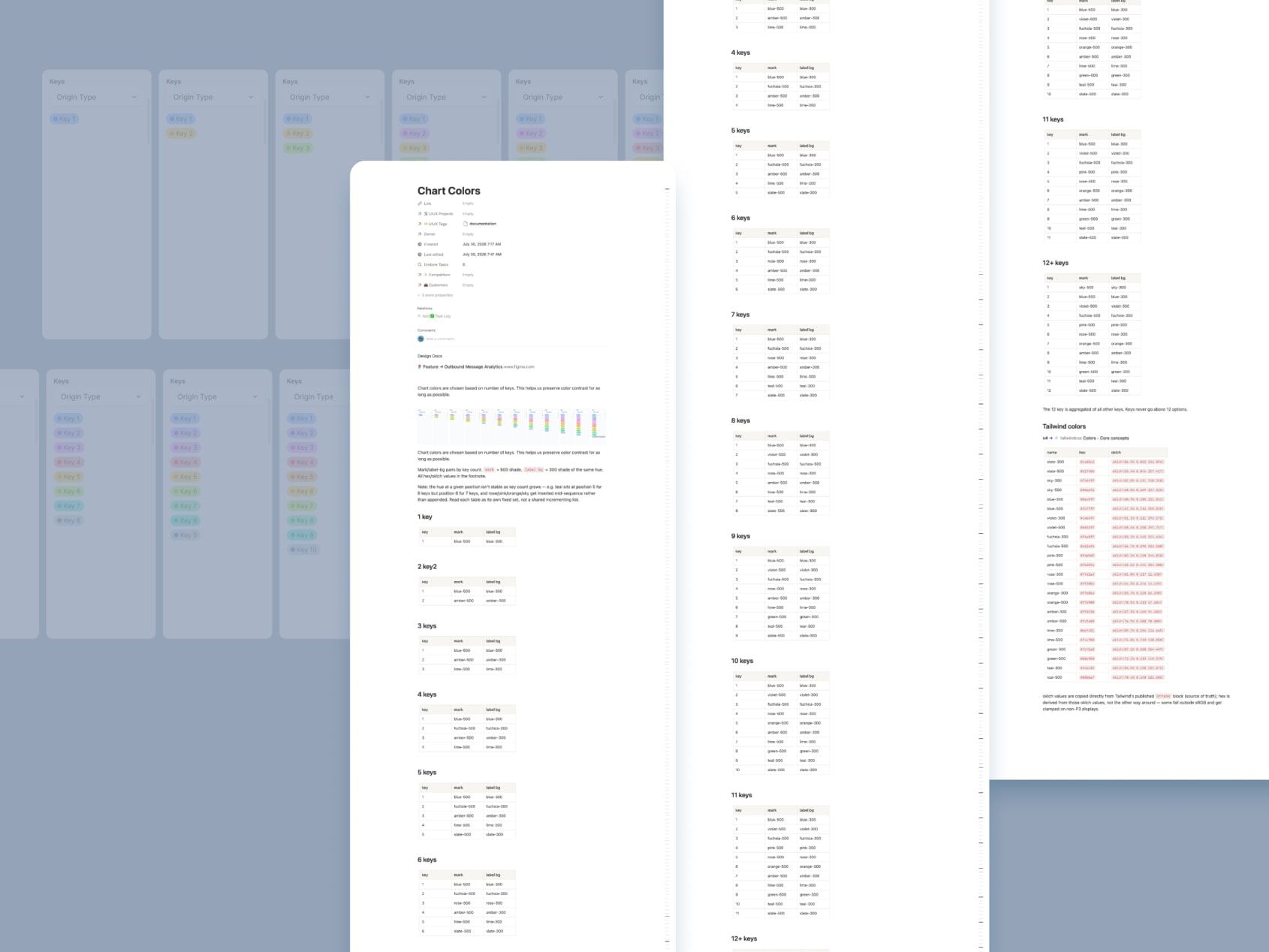
Chart Documentation
Document our chart colors in Notion. Colors are specific to number of keys on the chart. Color choice should not be arbitrary or change based on anything other than key count.
This makes sure that keys are as readable as possible to all users across as many devices as possible.
Group Switcher
The Group Switcher has been updated to incorporate more info and context to make choosing the correct group easier.
- added links to the full group and org setting screens
- added phone numbers
- add group status labels
- indicators and tooltips showing whether a group uses the corp number, has its own number assigned, and is available for sending
- new filter and sorting options
- cleaned up visual design

Dashboard
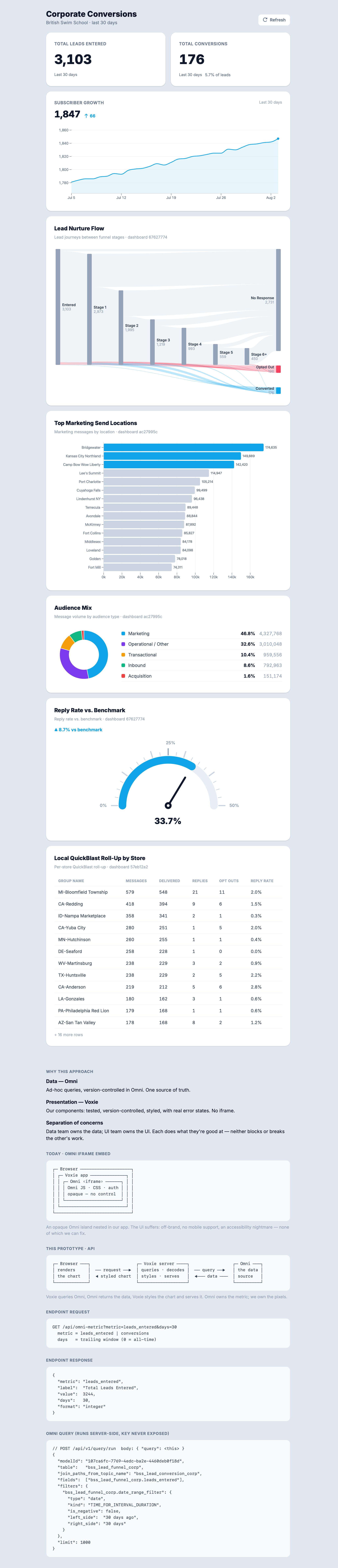
The original Dashboard work dates back to at least January 2023. This predates Franchise Hub by years. This new set of work aims to bring Dashboard up to speed by bring Franchise Hub level visibility to this page.
This round of work was research and defining the contexts required and the goals for each context + vertical combination.
Another key set of work was researching what is possible with Omni a data source but moving beyond their UI as it severely limits accessibility, branding, mobile platforms.
This work prepares the way nicely for a better Dashboard experience and possible better Omni backed analytics views going forward.
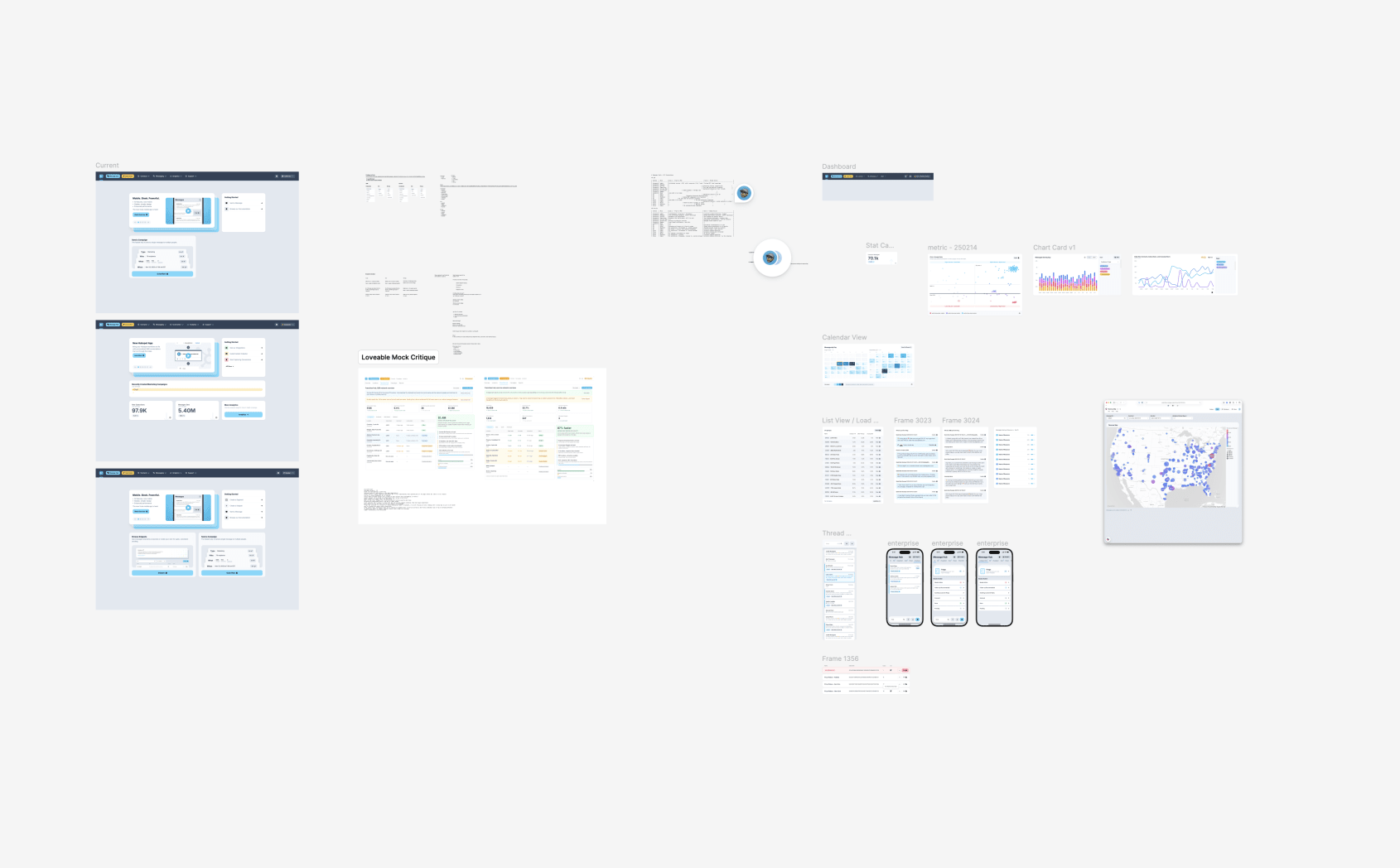
These charts us omni api but render using 100% voxie interface:
Prototypes Clean Up
- Fixed fonts not loading in production
- Switched to variable font loading which uses a single font file for all variations. Gives faster load times and smaller file size.
- Simplified the Hud and stopped it from auto popping up on load
- Cleaned up hover states on home page
