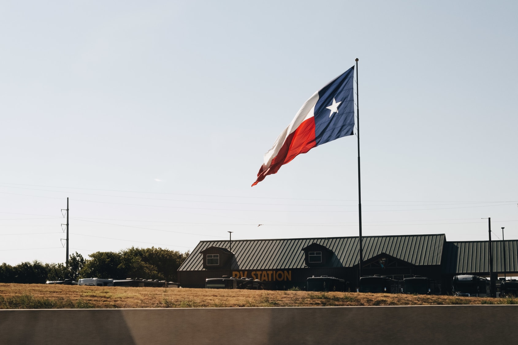
Demo 260831
-
Dashboard Updates
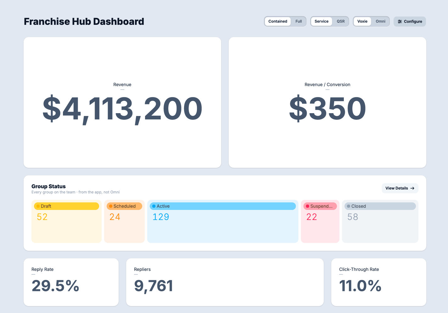
A round of work on the Dashboard demo focused on making the charts easier to read, adding two new kinds of cards, and cleaning up problems the prototype had picked up along the way.
Colors that mean something
Until now, chart colors were assigned by position. The first item in a chart got blue, the second got teal, and so on. That meant the same thing could be a different color in every chart, and two charts sitting side by side could tell you two different stories with the same color.
Colors are now tied to meaning instead of only order. Suspended is always the same rose, everywhere it appears, on every chart. Charts that aren’t covered by that list still fall back to the old ordered palette, so nothing breaks.
Two new cards
The first is a What’s New card, which brings the product announcement carousel from production into the dashboard. The content and behavior are the same as what customers see today, but it is framed like every other card on the dashboard so it doesn’t feel bolted on. It’s available to both verticals.
The second is a Note card. Every other card reads data and shows it back to you. This one is a place to write. It supports light markdown formatting, so a team can leave context.
Fixes and cleanup
The funnel and flow charts had a bug where the page could get stuck redrawing itself in a loop, which took the editing controls down with it. That’s fixed.
Dependencies
The prototype was also brought up to date with the rest of our tooling: newer versions of the frameworks, package manager, and icon library it depends on. No visible change, but it keeps this demo on the same footing as everything else we maintain.
Voxie UI Updates
Enhancements
- buttons
- added consistent button scaling on click
- button loading animation now matches prod
- added reduced motion loading state
- forms and inputs
- made textarea always grow. only show resize handle on older browsers
- cleaned up radio style so it matches figma
- added a forms pattern page
- restructured the nav and the sidebar
- expanded look and feel page content
- page layout updates
- rewrote
- adjusted examples
- added full screen viewing
New Components
- select
- input
- modal
- checkbox
- radio
- forms

On Site
Deep conversations about process and how to increase quality and output at Voxie.
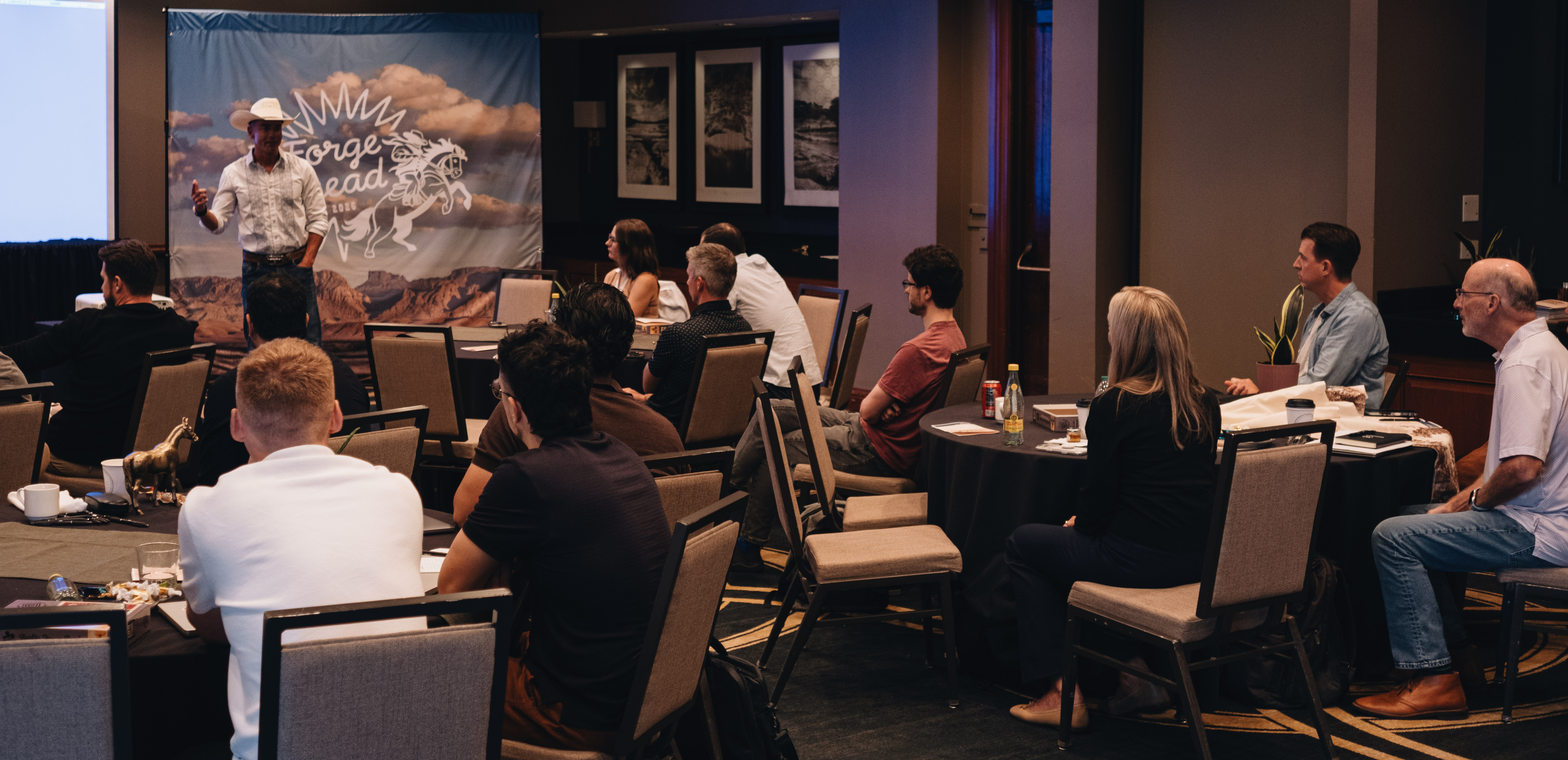
This will result in a shift in focus for the UI Team to build tools for others to do their work better and provide design feedback and critique on prototypes that others bring.
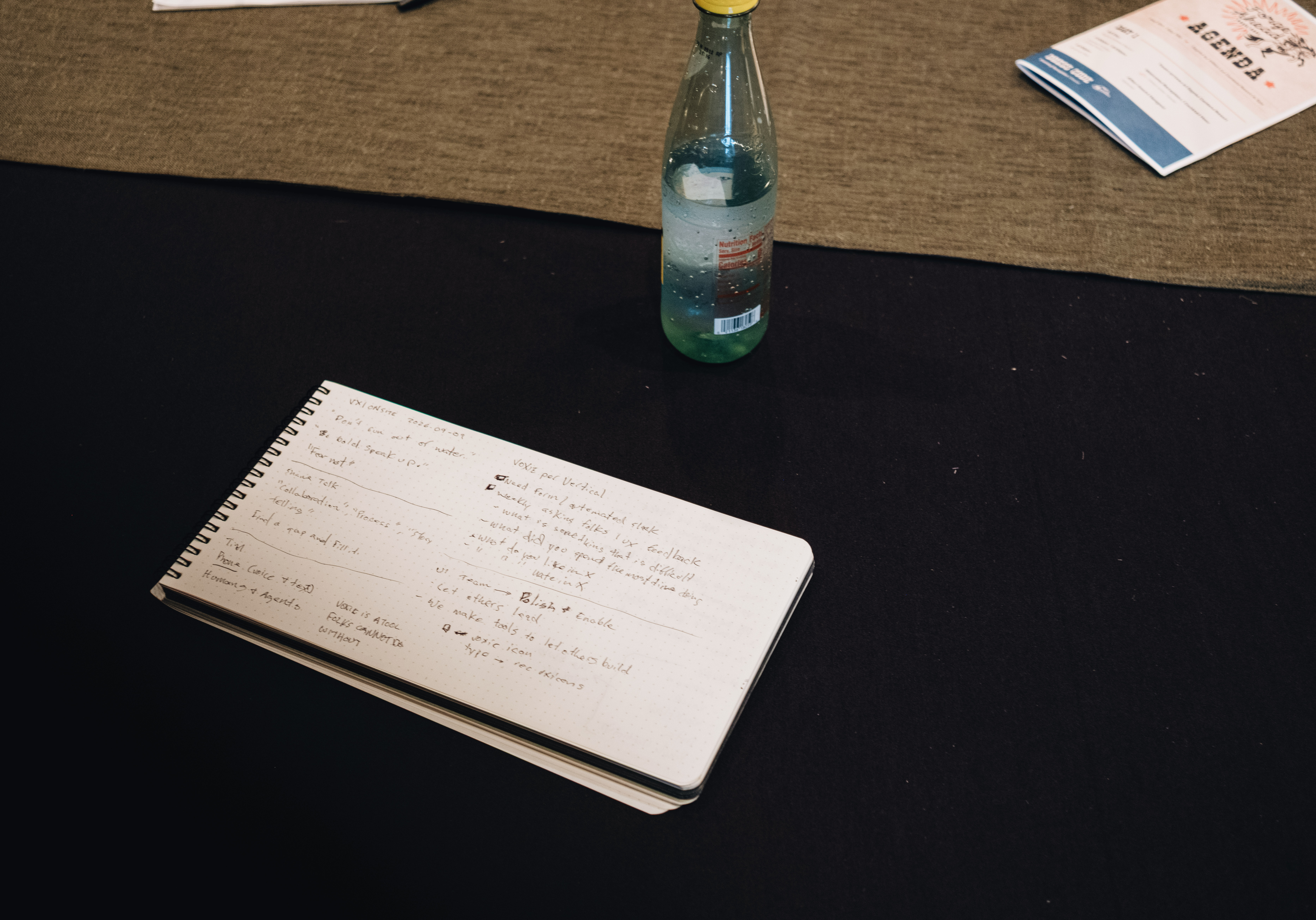
We have found that UI being at the front of the process is an older way of working and that items already go around this process. This new workflow puts Product and Engineering team in charge of bringing v1 of prototypes to UI team for direct feedback.
This change should allow the default state of the UI team to look for, and correct UX and design issues. Our job will be to provide direct design, code, conceptual feedback on vibe coded prototypes directly from Product team. We will also look to build AI skills and tools to help folks reach more robust prototypes.