Dashboard Updates
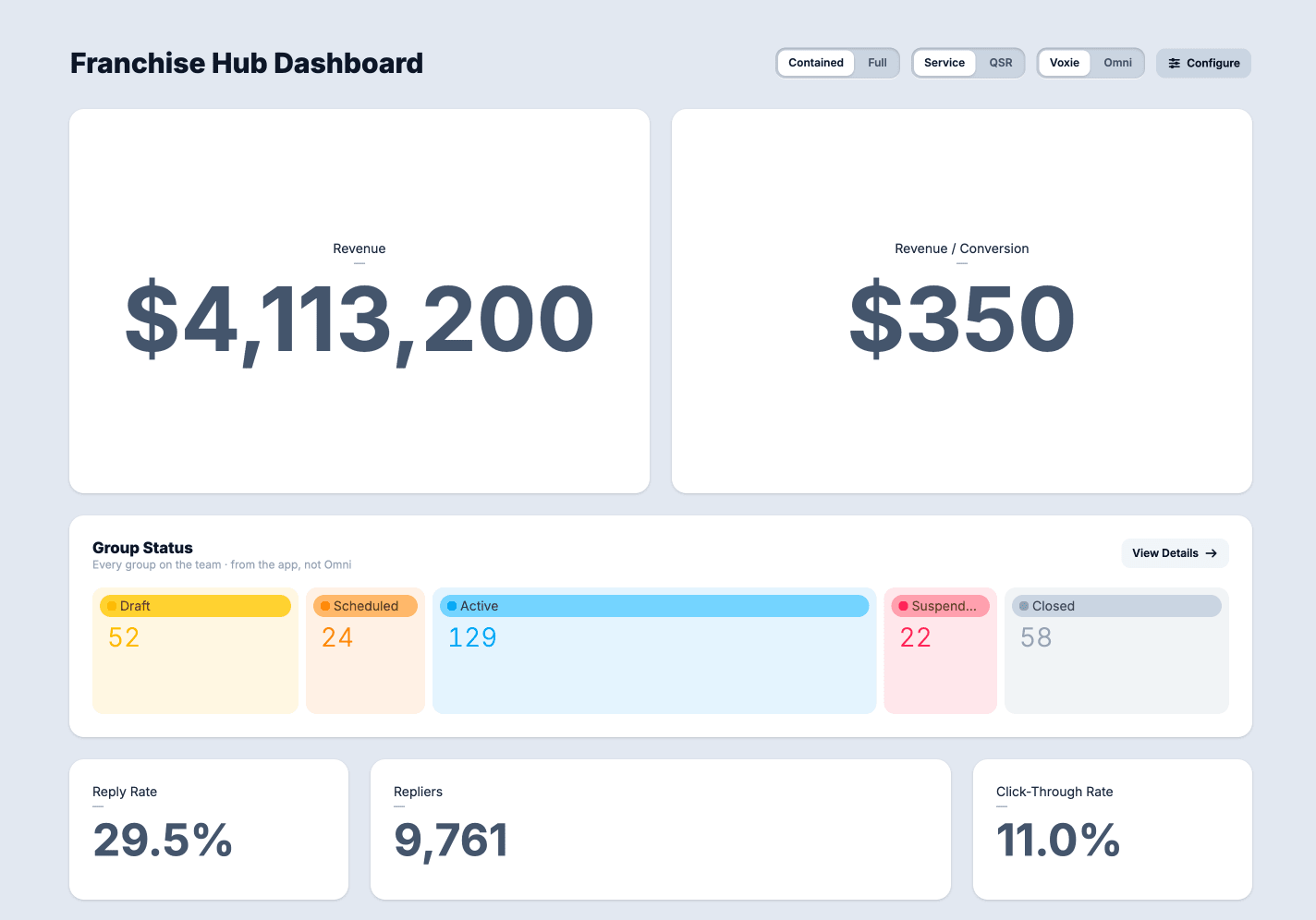
A round of work on the Dashboard demo focused on making the charts easier to read, adding two new kinds of cards, and cleaning up problems the prototype had picked up along the way.
Colors that mean something
Until now, chart colors were assigned by position. The first item in a chart got blue, the second got teal, and so on. That meant the same thing could be a different color in every chart, and two charts sitting side by side could tell you two different stories with the same color.
Colors are now tied to meaning instead of only order. Suspended is always the same rose, everywhere it appears, on every chart. Charts that aren’t covered by that list still fall back to the old ordered palette, so nothing breaks.
Two new cards
The first is a What’s New card, which brings the product announcement carousel from production into the dashboard. The content and behavior are the same as what customers see today, but it is framed like every other card on the dashboard so it doesn’t feel bolted on. It’s available to both verticals.
The second is a Note card. Every other card reads data and shows it back to you. This one is a place to write. It supports light markdown formatting, so a team can leave context.
Fixes and cleanup
The funnel and flow charts had a bug where the page could get stuck redrawing itself in a loop, which took the editing controls down with it. That’s fixed.
Dependencies
The prototype was also brought up to date with the rest of our tooling: newer versions of the frameworks, package manager, and icon library it depends on. No visible change, but it keeps this demo on the same footing as everything else we maintain.