Franchise Hub Dashboard Component Docs
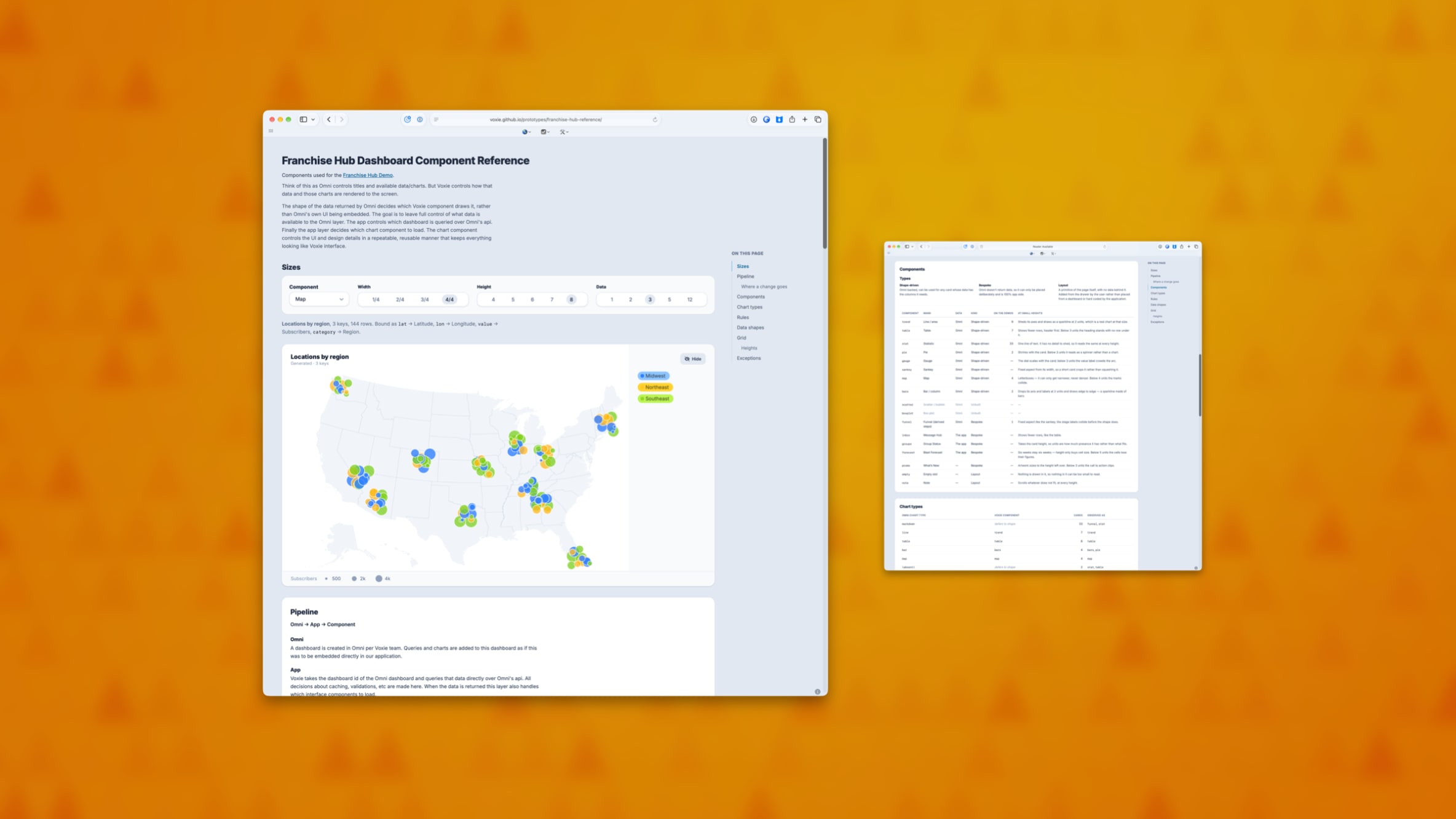
There is now a single reference page for the Franchise Hub dashboard. It shows every chart the dashboard can draw, the component that draws it, and how each one looks at every size it can be placed at.
Why it matters
Answering “what does this actually look like” used to mean building a throwaway page, or finding a customer account that happened to have the right data in it. Now there is one place to look, and it covers every case rather than the handful someone thought to check.
It also makes gaps obvious. A chart type that renders badly at a small size, or one that has no component behind it at all, is visible at a glance instead of turning up when someone builds a dashboard around it.
Where a change belongs
The page also documents which parts of the dashboard read from our reporting tool and which read from the app itself, and where a given change needs to be made.
That question came up repeatedly and the answer lived in people’s heads. Writing it down means design and engineering start from the same map, and a request lands with whoever actually owns that layer.
Built on the design system
The prototypes now pull in Voxie UI directly, along with its rules for AI tools, rather than approximating the design system by hand. What gets reviewed looks closer to what would ship, and prototypes built with AI assistance start from our real components instead of inventing their own.