Voxie UI Expansion
product
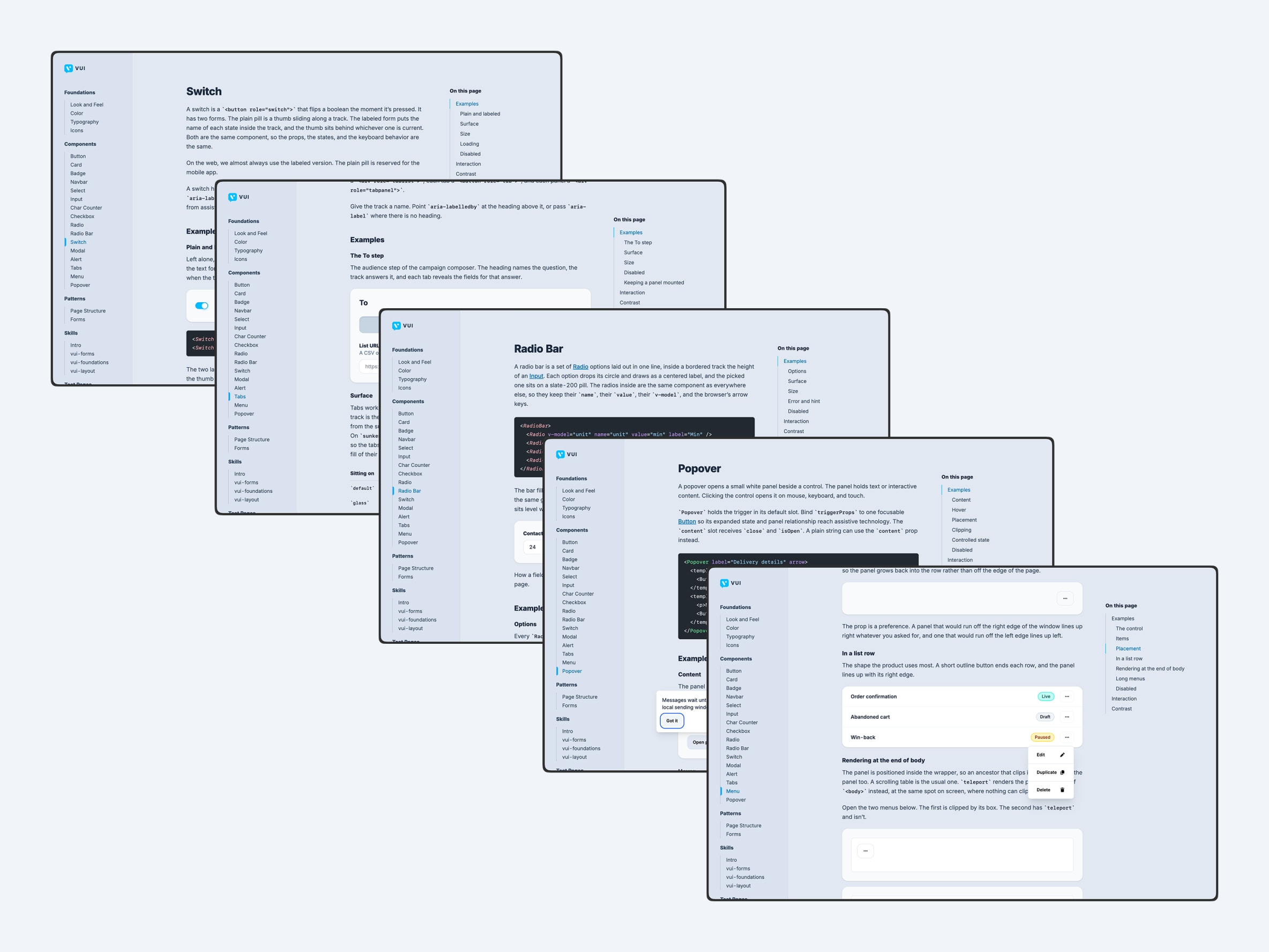
VUI expanded significantly across both the component library and its documentation.
- More components and patterns: Added Switch, Tabs, Radio Bar, Menu, Menu Item, and Popover, along with supporting tab components.
- Refined interaction and visual consistency: Tabs, Radio, Checkbox, Radio Bar, and Menu received updates to states, spacing, borders, cursor behavior, animation, and surface styling so they behave more consistently across VUI.
- Improved documentation and discoverability: The docs gained a new Skills introduction, clearer navigation, linked homepage cards, in-page navigation, stronger component guidance, and improvements to pages like Look and Feel, Color, Buttons, Icons, and Page Structure.
- Better responsive and typographic foundations: Color layouts now adapt better to smaller screens, and heading styles were aligned with the VUI typography scale instead of relying on global CSS.
- Stronger demo and development workflow: The site can now deploy through GitHub Pages, test pages were converted to Vue so real VUI components can be demonstrated, and separate Skills and docs test runs were created for easier comparison.