Icons and Chart Colors
product
Additions to the design system documentation.
Icons
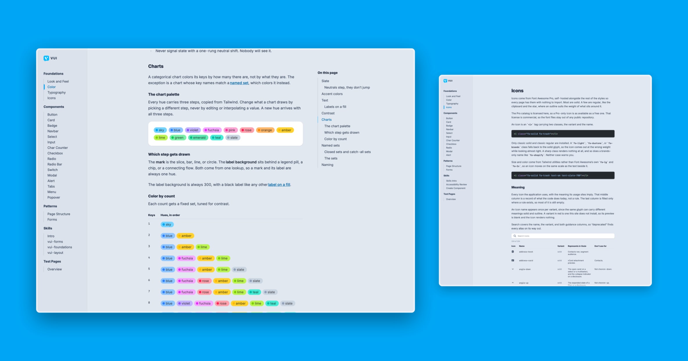
Icons are now documented as a foundation, alongside color and typography. The guidance covers which icon to reach for, and settles a few cases that had been decided differently in different places. Anyone building a screen now has an answer to look up instead of a judgment call to make.
Chart color keys
How charts get their colors is now written down. This is the rule that ties a color to what it means rather than to where it lands in a list, so the same status reads the same way in every chart. Documenting it means new charts follow it by default instead of each one inventing its own palette.