Voxie Logo Update
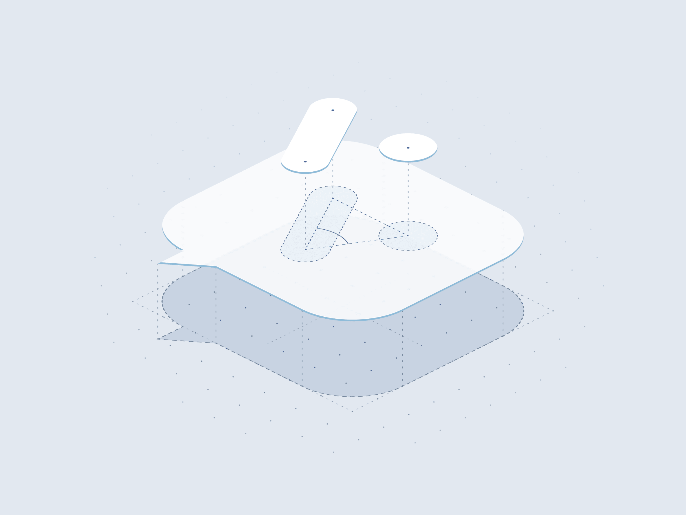
The Voxie logo is looking a little sharper. We cleaned up some rough edges, added better alignment, and made it more balanced.
Issues with the Original
- Misaligned arms. The two arms didn’t line up cleanly around a shared bottom vertex.
- A weird sharp point. The left arm ended in a sharp corner on an otherwise rounded mark. It felt like an accident rather than a detail that belonged there.
- A gradient. These things are hard or impossible to reproduce in places like embroidery or signage.
- A dot that felt too light. The dot wasn’t optically scaled to match the main arm’s weight. It needed a little extra size to feel balanced beside the longer white stroke.
Fixing Things with Math
We wanted to fix these issues in a systematic way so we built a little mathematical playground for making adjustments. We’ll save the boring details but in short we used trigonometry to calculate the angle and length of the V arms so we could dynamically position the left arm and dot as we adjusted size parameters.
Here’s a sample.
const radians = angle * Math.PI / 180;
const dx = length * Math.sin(radians);
const dy = length * Math.cos(radians);

const left = { x: vertex.x - dx, y: vertex.y - dy };
const right = { x: vertex.x + dx, y: vertex.y - dy };
Balancing the Math
If everything in this design is mathematically equal, we run into some problems. To balance things out, we need to do what’s called optical alignment. This is just visually adjusting things until they look right.
- The dot looks too small. If the dot uses the same diameter as the stroke’s width, the isolated circle ends up looking too small in comparison. We scale it up to compensate.
- Dot position looks too high (or low). When the dot weight is increased, it overshoots a little so that the top edge doesn’t exactly line up with the arm. We applied a very slight offset to balance it out. Notice the dot still sits higher though. We need some of this or the dot will look too low.
- The V looks too high. The wider top of the V takes up more visual weight so when it’s mathematically centered, it ends up looking too high. To counter balance this, we shift the mark down.
- The blue box doesn’t look square. If the dimensions on the chat bubble match exactly, it will look to tall. We increased the width slightly to fix.
The Result
Below you can see the mathematically even version, the adjust version, and a custom version where you can drag around sliders to see how everything works.
The interactive geometry controls require JavaScript. The current values are a 34-unit bubble, 33°, length 12, stroke 6, and a dot 1.2 times the stroke width.
Before and After
Download It
The source of truth for this logo will be held in our frontend component library used by our app and website. That way the logo always matches what’s used in production. You can get the most up to date version here: Voxie Logo Download
Note: This will download as an SVG file. You’ll need some design knowledge to use it.