Layout Component
product
Summary
Voxie pages got a design upgrade with a new component that creates consistent layouts across all pages of the site.
Scale of the Work
- Updated hundreds of pages across the app using a shared layout component.
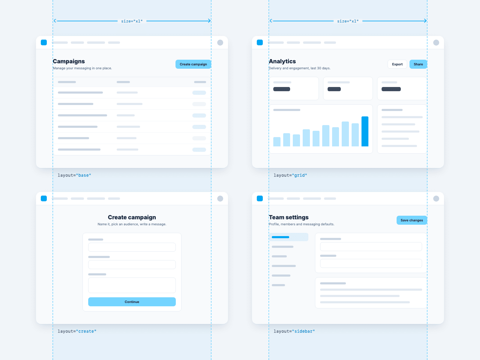
- Consolidated page layouts into a few reusable patterns, including grids, sidebars, and create screens.
- Base: a single open content area, for tables and lists.
- Grid: a 12-column grid, for dashboards and analytics.
- Create: a centered single column, for focused tasks like creating a campaign.
- Sidebar: navigation on the left with content beside it, for settings pages.
Before and After
- Previously, pages had inconsistent widths, spacing, and overflow issues.
- The new component provides a consistent layout experience as users navigate across the app.
How the Work Evolved
- Established consistent layout patterns through the design work in VUI.
- Translated those patterns into a reusable component in our frontend-components library.
- Rolled out the component across the application.