Demo 260914
-
Group Operations
Prototypes came from the product team this sprint and went through rounds of design revisions, critique and feedback from UI Team. This is the working arrangement we moved to after the on site: product brings a first version, the UI team revises it.
Group Operations
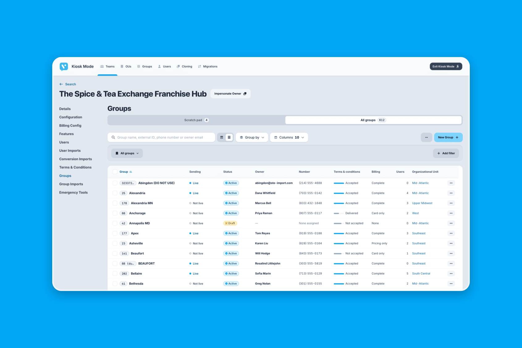
Selecting rows moved to checkboxes, which is what people expect from a table and what the rest of the product already does. Table headers now stay put while you scroll, so you don’t lose track of which column you are reading once the list gets long.
Tables also gained group by concept and ability to save and share filter sets. These are conceptual at this point and may not make it to production on this feature.
A separate version was built with 2,000 rows in it, paged through section by section. Prototypes are usually built with a dozen tidy rows, which hides the problems that only appear at real scale. This version puts the design under the load an actual customer account would put on it.
The rest was cleanup: the current brand mark in the navigation, cards sized to their content, and a file preview that scrolls properly.
Opening a Group from a Table
There are several reasonable ways to let someone open a group from a row in a table. The row name could be the link. A View button could sit at the end of the row. The whole row could be clickable.
Each has a tradeoff, and the tradeoffs are hard to argue in the abstract. A clickable row is the fastest to hit but makes it easy to open something by accident. A View button is unmistakable but adds a column.
Build all of them instead of picking one
Every option was built into a single prototype behind a picker. Reviewers switch between them against the same data, in the same layout, and say which one they prefer.
This turns a design debate into something people can try. It also surfaces the problems that only appear in use, like an option that feels fine on a short list and becomes tedious on a long one.
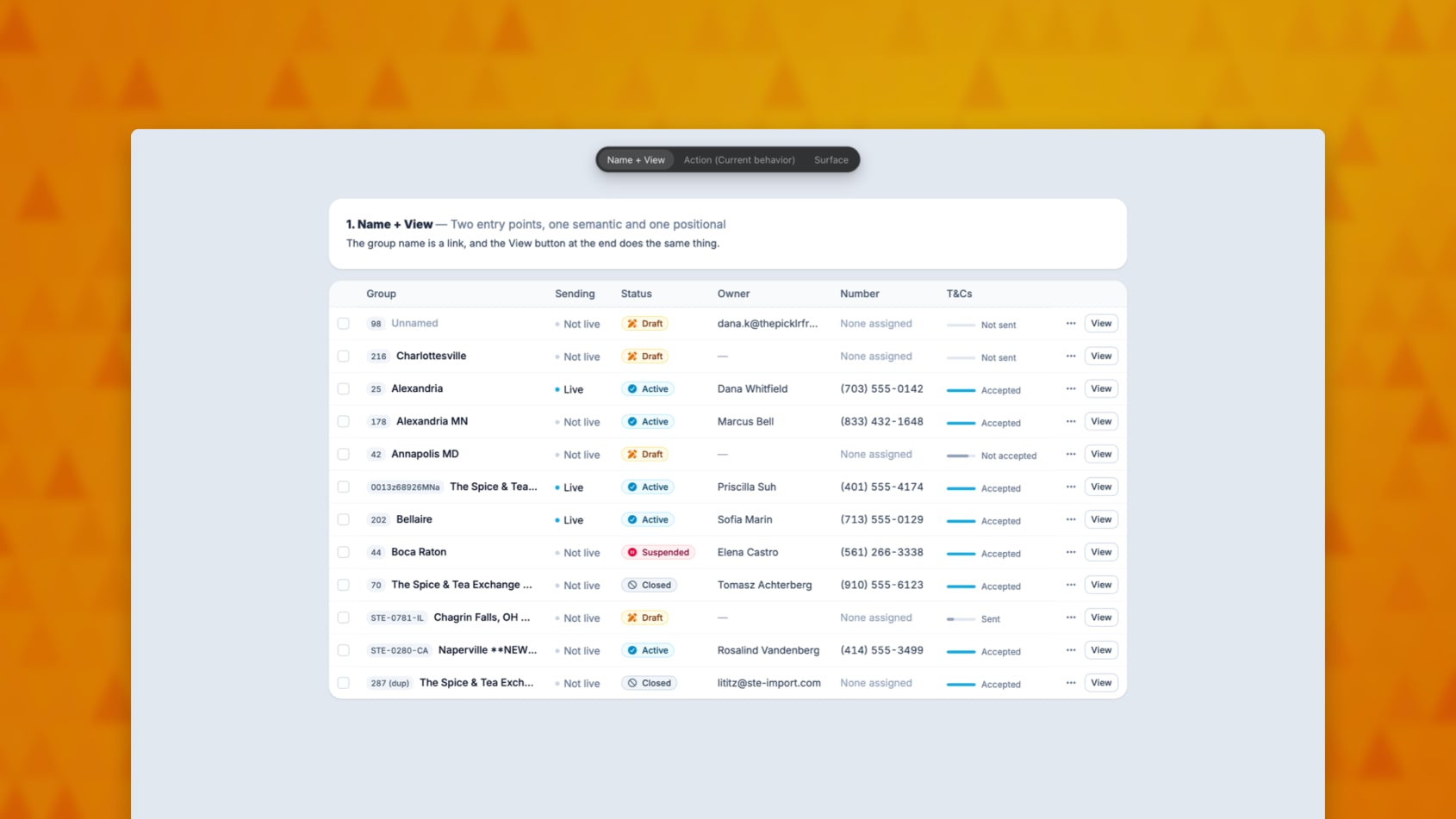
Chart Types and Color
Three changes to how the dashboard draws data.
Bars that stack
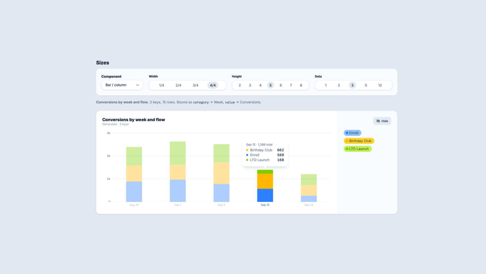
A bar chart now stacks when its data carries a second dimension. If you are looking at volume by location and the data also splits by status, each bar shows that breakdown inside it.
Before, the second dimension was simply lost. You saw the total and had to open a different report to find out what it was made of.
One chart per measure
A report that tracks several measures at once used to force all of them into a single chart. Measures on different scales made that chart unreadable, since a value in the thousands flattens a value in the dozens into a line along the bottom.
Those now fan out into one chart per measure, each scaled to its own data.
Fixed colors for opt-in and opt-out
Opt-in is drawn in sky and opt-out in amber, everywhere either one appears.
These two values show up across many charts and tables, and the color used to depend on where the value happened to land in the list. The same status could be one color in one chart and a different color in the chart beside it, which is actively misleading when someone is scanning a dashboard rather than reading it closely.
Icons and Chart Colors
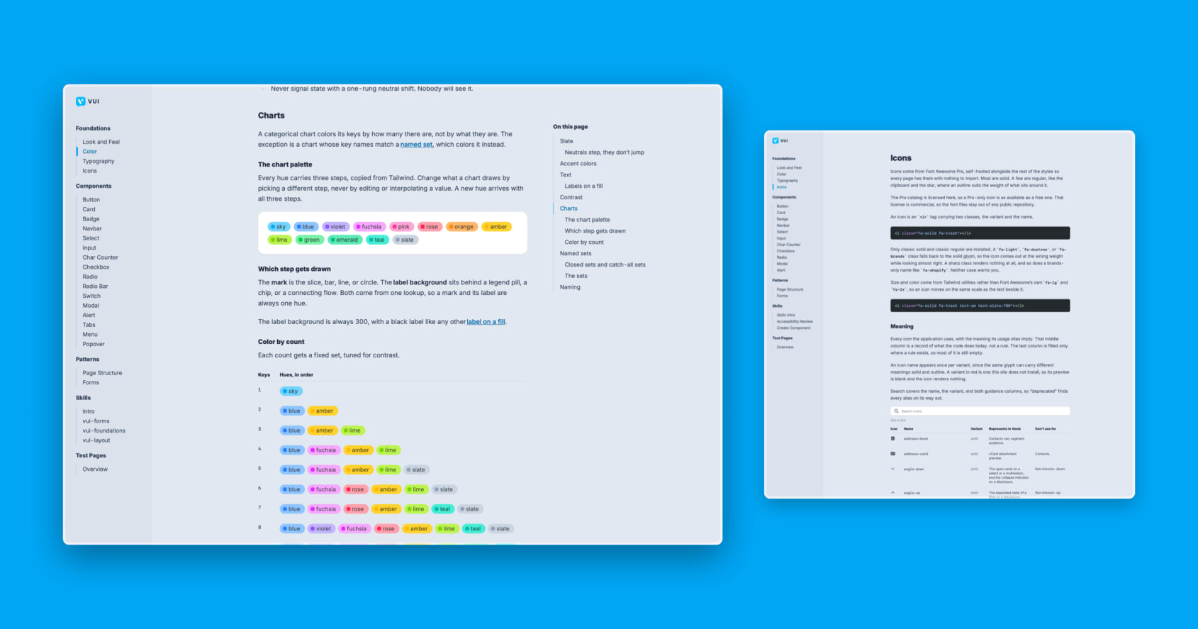
Additions to the design system documentation.
Icons
Icons are now documented as a foundation, alongside color and typography. The guidance covers which icon to reach for, and settles a few cases that had been decided differently in different places. Anyone building a screen now has an answer to look up instead of a judgment call to make.
Chart color keys
How charts get their colors is now written down. This is the rule that ties a color to what it means rather than to where it lands in a list, so the same status reads the same way in every chart. Documenting it means new charts follow it by default instead of each one inventing its own palette.
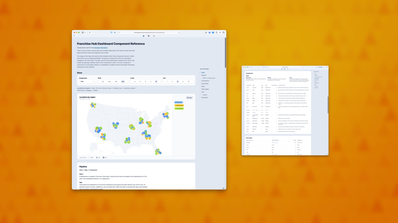
Franchise Hub Dashboard Component Docs
There is now a single reference page for the Franchise Hub dashboard. It shows every chart the dashboard can draw, the component that draws it, and how each one looks at every size it can be placed at.
Why it matters
Answering “what does this actually look like” used to mean building a throwaway page, or finding a customer account that happened to have the right data in it. Now there is one place to look, and it covers every case rather than the handful someone thought to check.
It also makes gaps obvious. A chart type that renders badly at a small size, or one that has no component behind it at all, is visible at a glance instead of turning up when someone builds a dashboard around it.
Where a change belongs
The page also documents which parts of the dashboard read from our reporting tool and which read from the app itself, and where a given change needs to be made.
That question came up repeatedly and the answer lived in people’s heads. Writing it down means design and engineering start from the same map, and a request lands with whoever actually owns that layer.
Built on the design system
The prototypes now pull in Voxie UI directly, along with its rules for AI tools, rather than approximating the design system by hand. What gets reviewed looks closer to what would ship, and prototypes built with AI assistance start from our real components instead of inventing their own.
Workflow Builder Test Mode
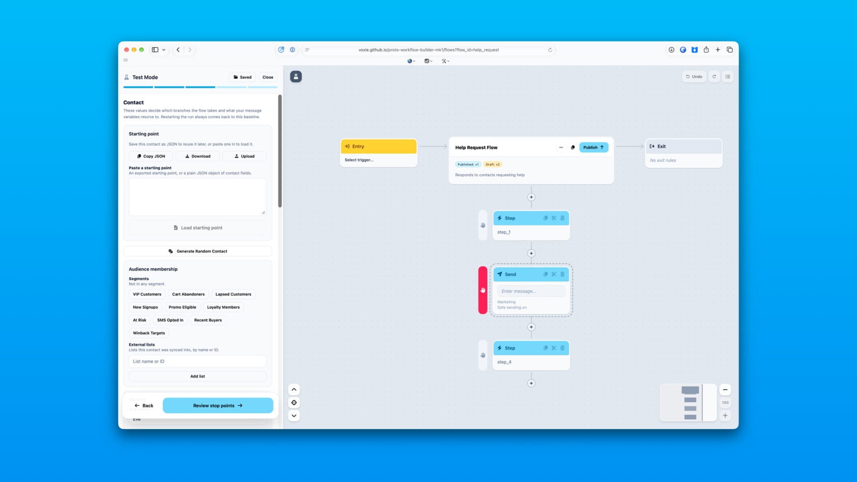
Test Mode is how someone checks that a workflow does what they intended before real customers go through it. It was rebuilt this sprint.
Setting up a test is now a guided path
Testing used to be one dense panel. It is now three steps: set up the test, run it, read the results. Each step asks for one thing at a time, so someone testing a workflow for the first time doesn’t have to know which fields matter.
Stop points
You can now pause a run at any step you choose and change the test contact before continuing. Put them in a segment, take them off a list, adjust their details, then let the run carry on.
This answers the question people actually have, which is not “does this workflow run” but “what happens to someone like this at this point”. Previously you had to build a new contact and start over for every variation.
Saved test setups
A test setup can be named and saved against the workflow it belongs to. Coming back a week later, or handing the workflow to someone else, no longer means rebuilding the test from scratch.
The run tells the truth
If a step can’t execute, the run now ends there and says so. Before, a run could appear to continue past a step that never actually happened, which made a broken workflow look like a working one. Results now only show messages that were genuinely sent.